Graphic designer & social media manager who builds brands and keeps them talking.
I design visual identities, websites and packaging, then plan the content that makes people stop scrolling. Based in Italy, working with brands anywhere.
Get in touchThe archive
Hover over a folder to take a peek.
Tap a folder to open it, tap again to see the project.
Selected work
Duel Club
Brand identity
Trionfi
Brand identity, packaging
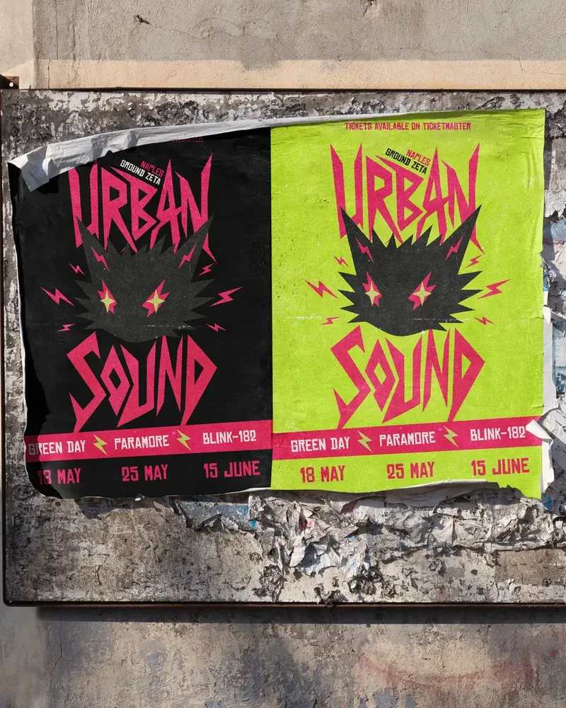
Urban Sound
Visual identity, posters
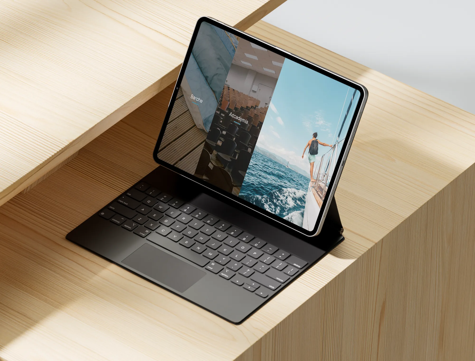
Helos Academy
UI/UX, web design
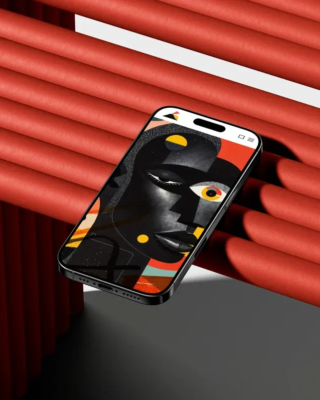
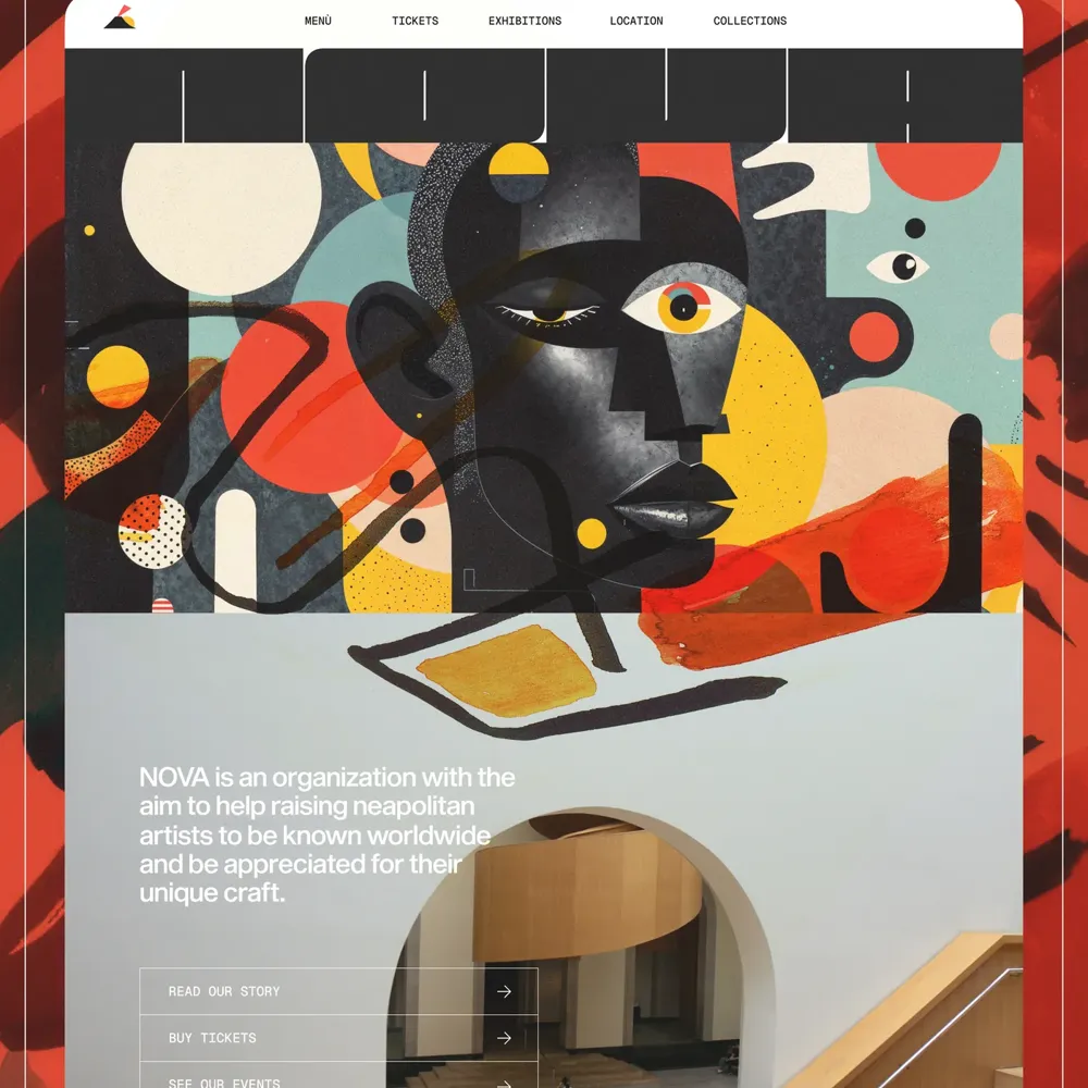
Nova Museum
UI/UX, web design
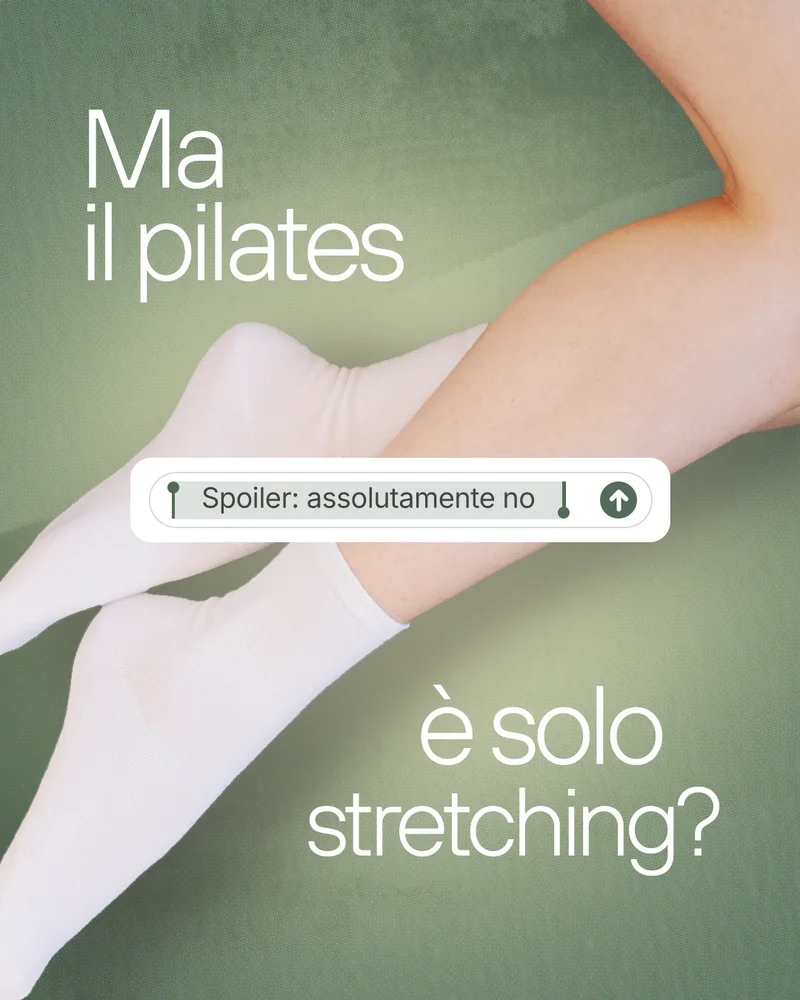
Social media
Case studies
What I do
- Brand identityLogo designVisual systemsTypographyColour palettesPackagingBrand guidelinesArt direction
- Web & UI/UX designWireframesPrototypesUser flowsResponsive layoutsFigmaFramerUsability
- Social media strategyContent pillarsTone of voiceAudienceReelsCarouselsCommunityGrowth
- Content planningEditorial calendarBriefsShot listsScriptsSchedulingTrendsCampaigns
- Copywriting & analyticsCaptionsHooksCalls to actionInsightsReachEngagementMonthly reports
Hi, I'm Sara

I'm a graphic designer and social media manager from Italy.
I trained in advertising design and then in social media management at Ilas, the Italian Academy of Communication in Naples. Since June 2026 I've been working at KokoDesign, a marketing and communication agency, where I design social content, visual identities and branding materials, edit videos for campaigns and help shape communication strategies and editorial plans.
Before design, I studied East Asian and African languages and cultures at L'Orientale in Naples, graduating with 110/110. I speak Italian, English, Korean and some Mandarin, which made me curious about how brands talk to different people. In 2025 I won the Ilas contest to design the logo for Duel Club's 20th anniversary.
Right now I'm going deeper into social strategy, advertising and online communication, and I'm open to relocating for the right role.
Download CVDesign
- Brand identity
- UI/UX design
- Motion graphics
- Video editing
Tools
- Photoshop, Illustrator, InDesign
- After Effects (certified)
- Figma
- Canva, CapCut
- DaVinci Resolve
Languages
- Italian, native
- English, C1
- Korean, intermediate
- Chinese, basic
Along the way
- 2019 – 2023BA in East Asian and African Languages and CulturesUniversity of Naples L'Orientale, 110/110
- 2024 – 2025Master in Advertising Graphic DesignIlas, Naples
- 2025Winner of the Duel Club logo contestLogo, brand applications and launch video
- 2025 – 2026Master in Social Media ManagementIlas, Naples, awarded as the contest prize
- June 2026 – nowSocial Media Manager & Graphic DesignerKokoDesign Marketing & Comunicazione, Naples
Graphic design
Trionfi craft beer
- Context
- Academic project
- Year
- 2025
- Services
- Packaging, brand identity
- Software
- Illustrator, Photoshop

A craft beer brand built on the tarot card of the Chariot.
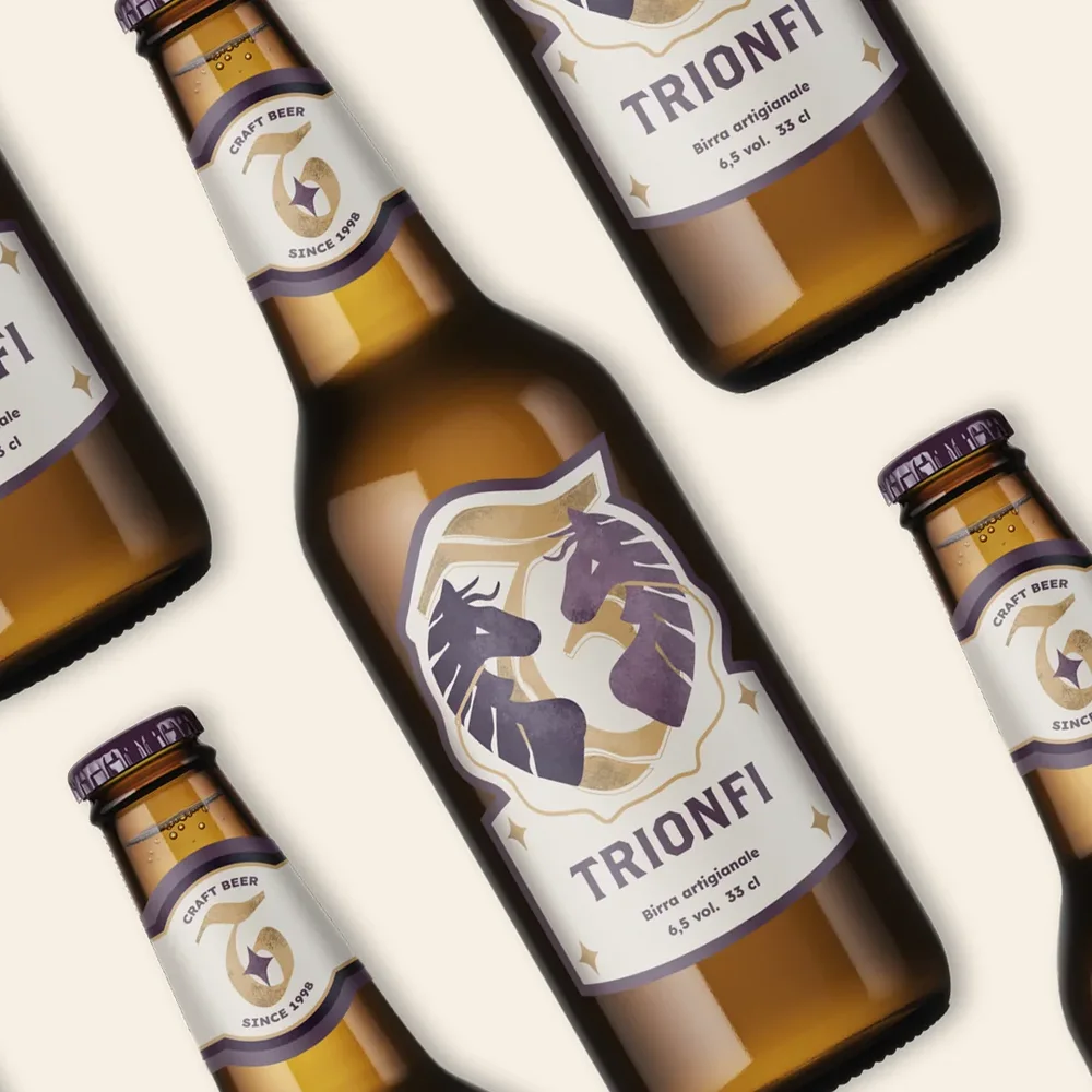
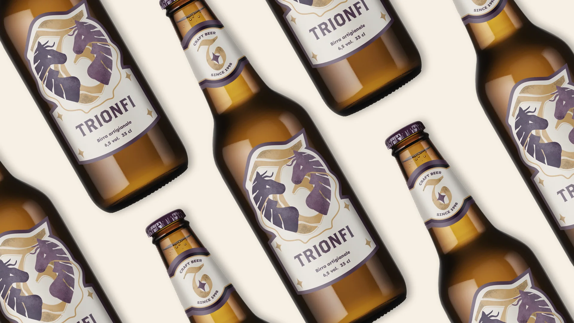
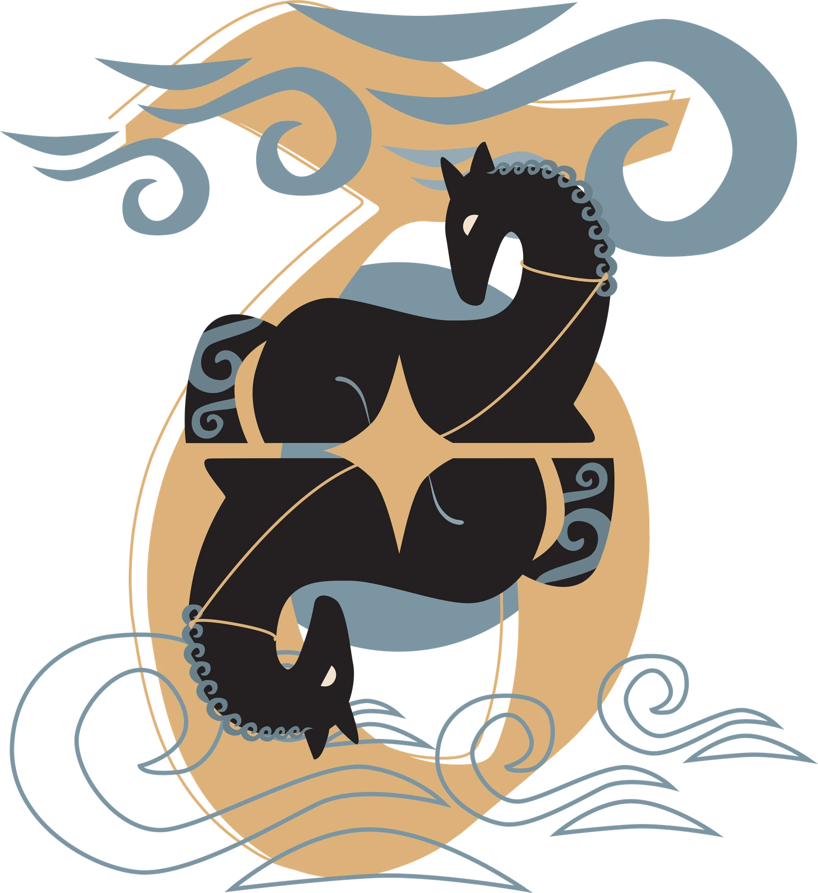
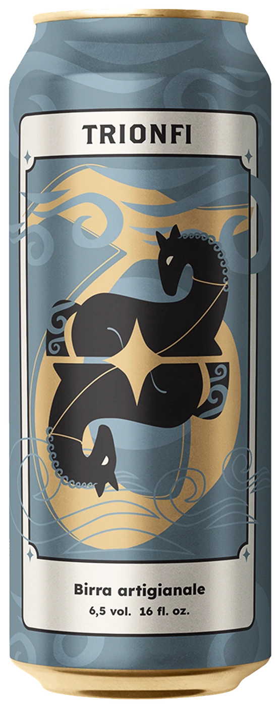
In the tarot, the Major Arcana are also called Trionfi, triumphs. The brand is built on one of them, The Chariot, which stands for triumph through willpower. Its symbolism lives in the label: two horses facing each other, one lighter and one darker, a reminder that guiding the chariot takes balance between opposite forces.
The label
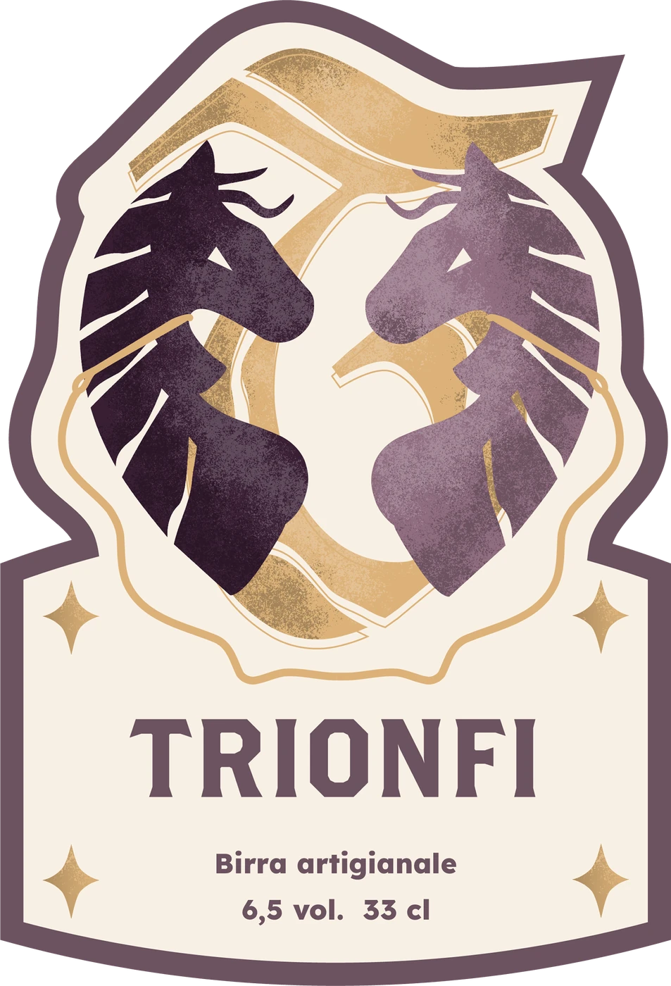
- Two horsesOne lighter, one darker: the duality of the Chariot card, and the balance needed to drive it.
- The logomarkThe letter T drawn in full so it stays legible, with the Trionfi star at its centre. Lighter and darker brushstrokes give it an antique feel.
- The wordmarkDerived from the Brothers typeface: direct and incisive, like the brand's message of personal achievement. Texts are set in Lexend.
- Viola occulto#391F34
- Viola arcano#906D80
- Giallo Trionfi#DCB279
- Lino#F8F0E4
Out in the world
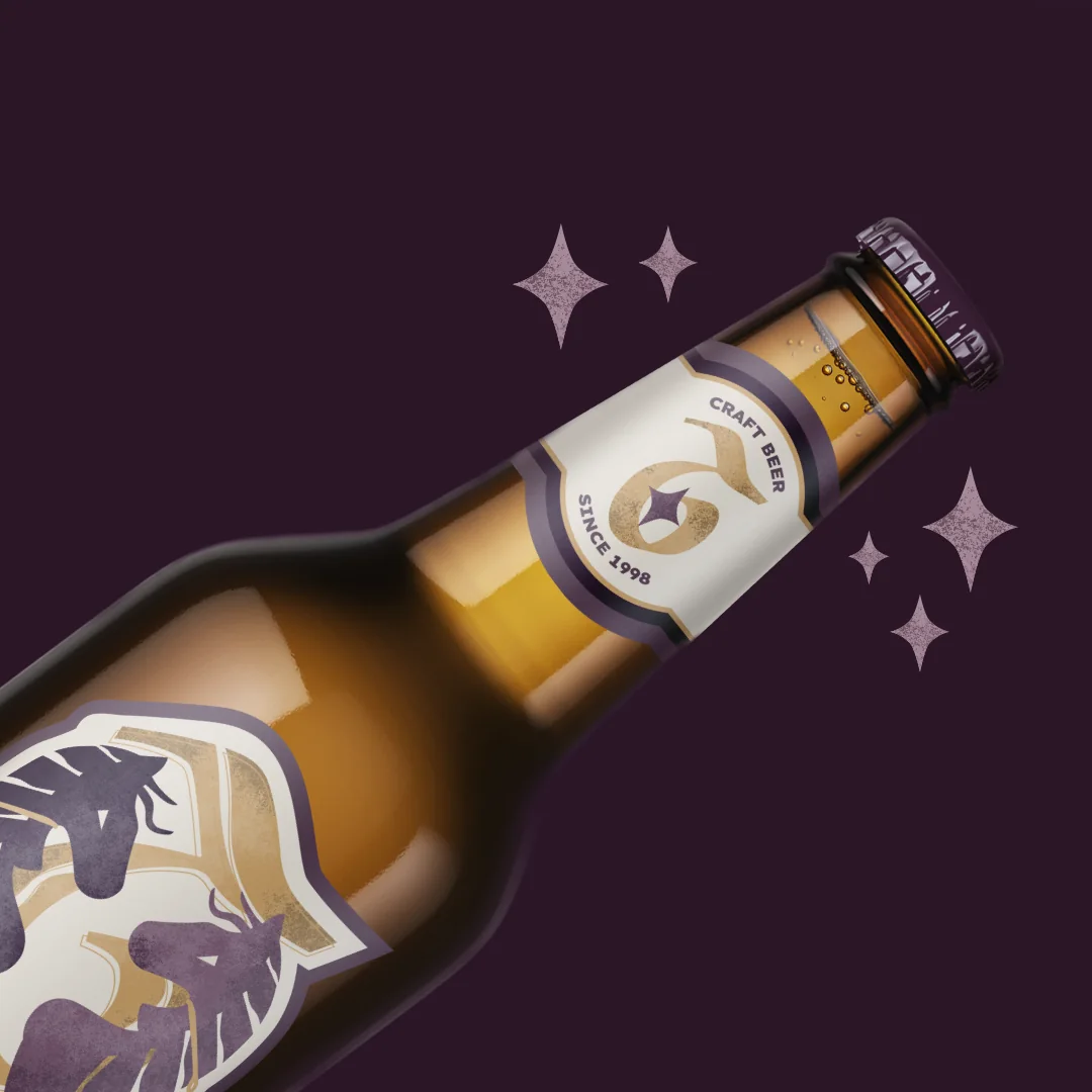
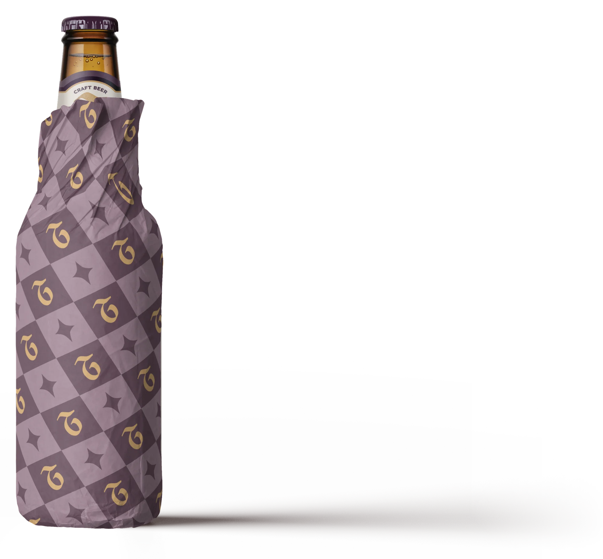
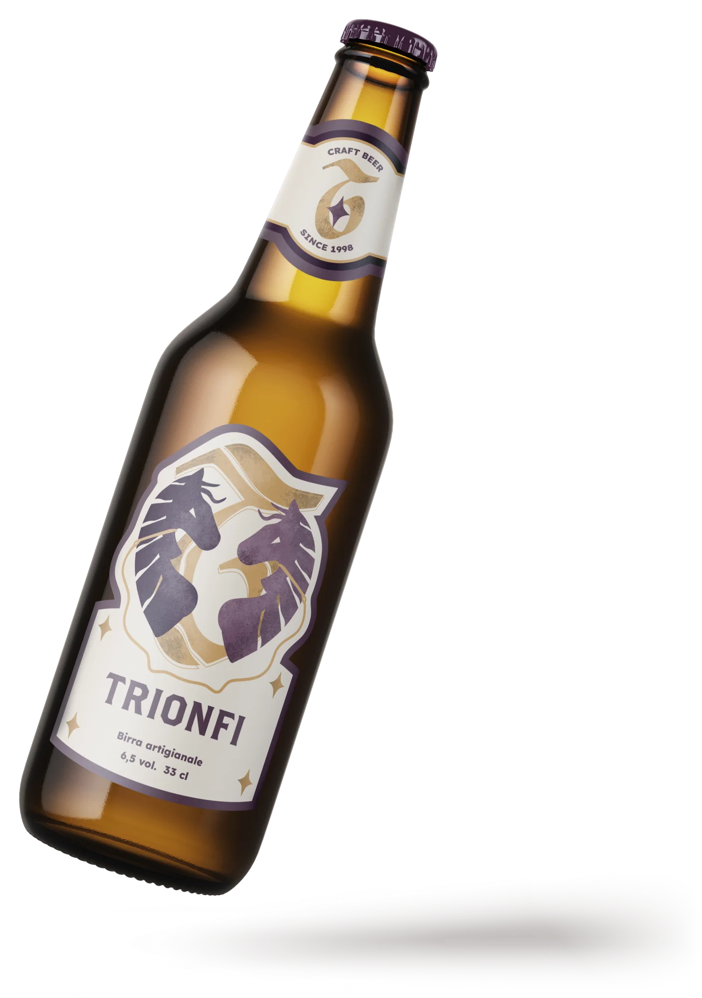
Special edition
A commemorative edition for the brand's fiftieth anniversary. The label returns to the Chariot with two mirrored horses, among sea waves and clouds, and a logo redrawn for the occasion. The beer comes in a can, inside a box printed with the same sea-and-cloud pattern.
- Nero uvetta#231F20
- Blu ardesia#6B818C
- Blu odissea#7C95A3
- Giallo Trionfi#DCB279
- Lino#F8F0E4
To Be stickers
- Context
- Academic project
- Year
- 2025
- Services
- Illustration, visual design
- Software
- Illustrator, Photoshop
Hamlet
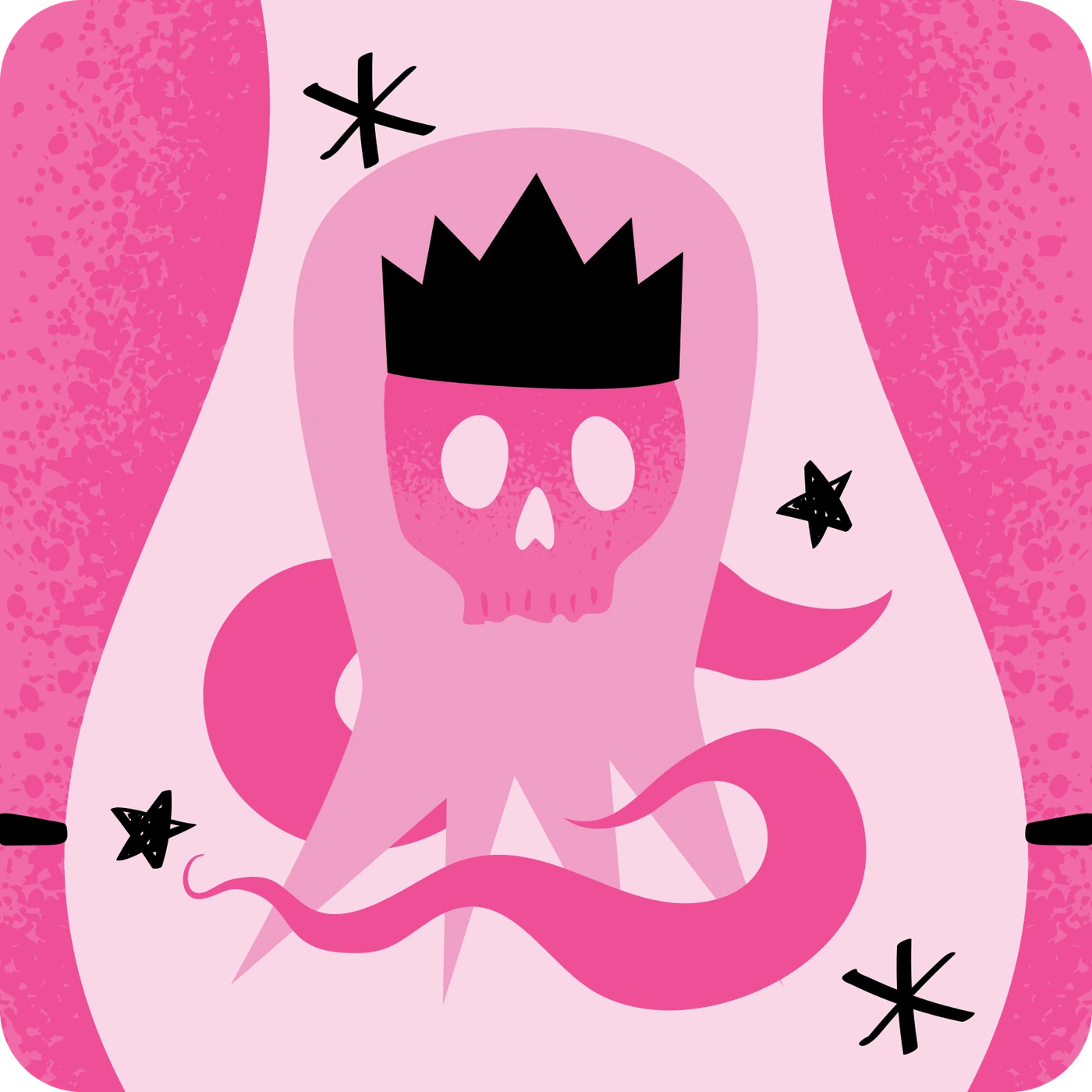
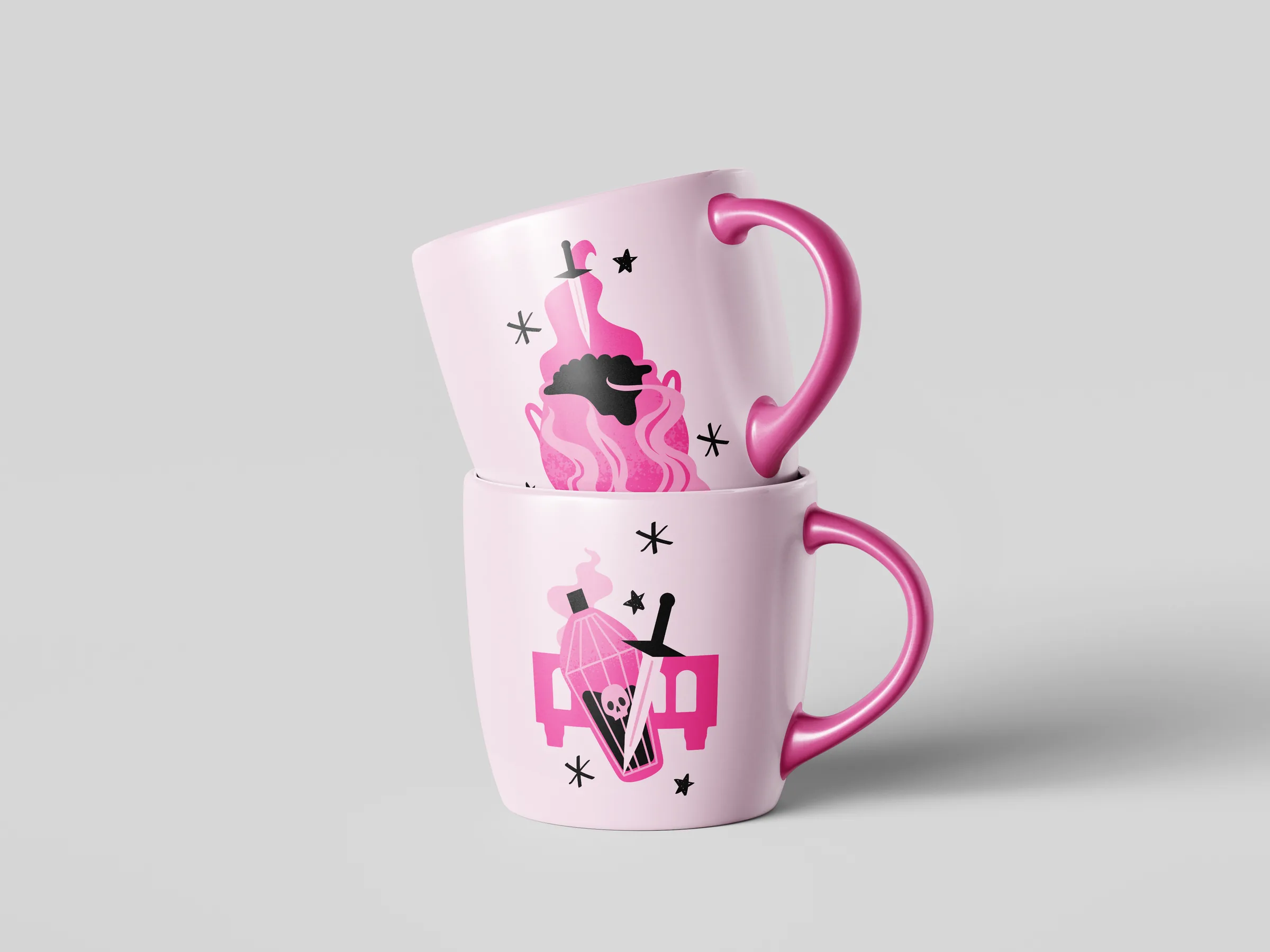
The ghost of Hamlet's father, whose skull recalls the famous ‘To be or not to be: that is the question’ scene.
Macbeth
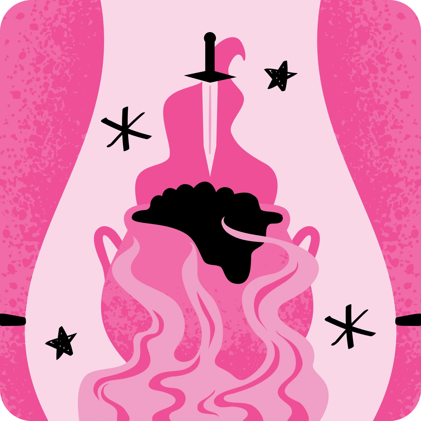
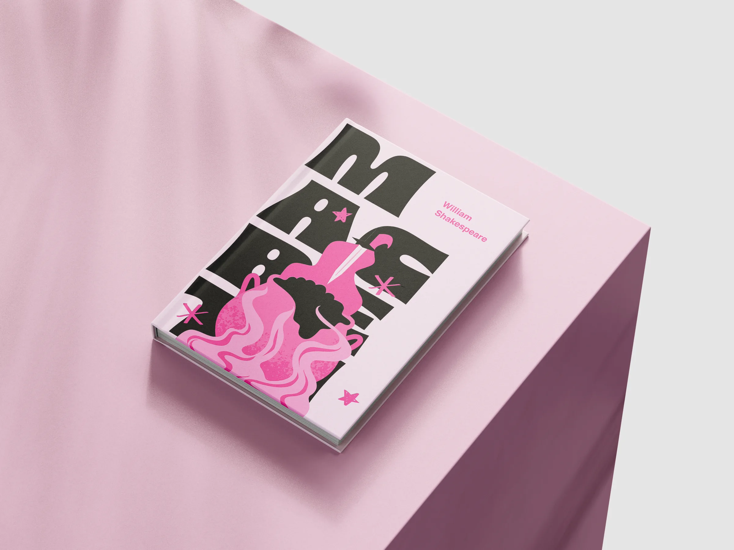
A bloodstained blade emerges from the witches’ cauldron, a sign of the fate and blood that will mark Macbeth.
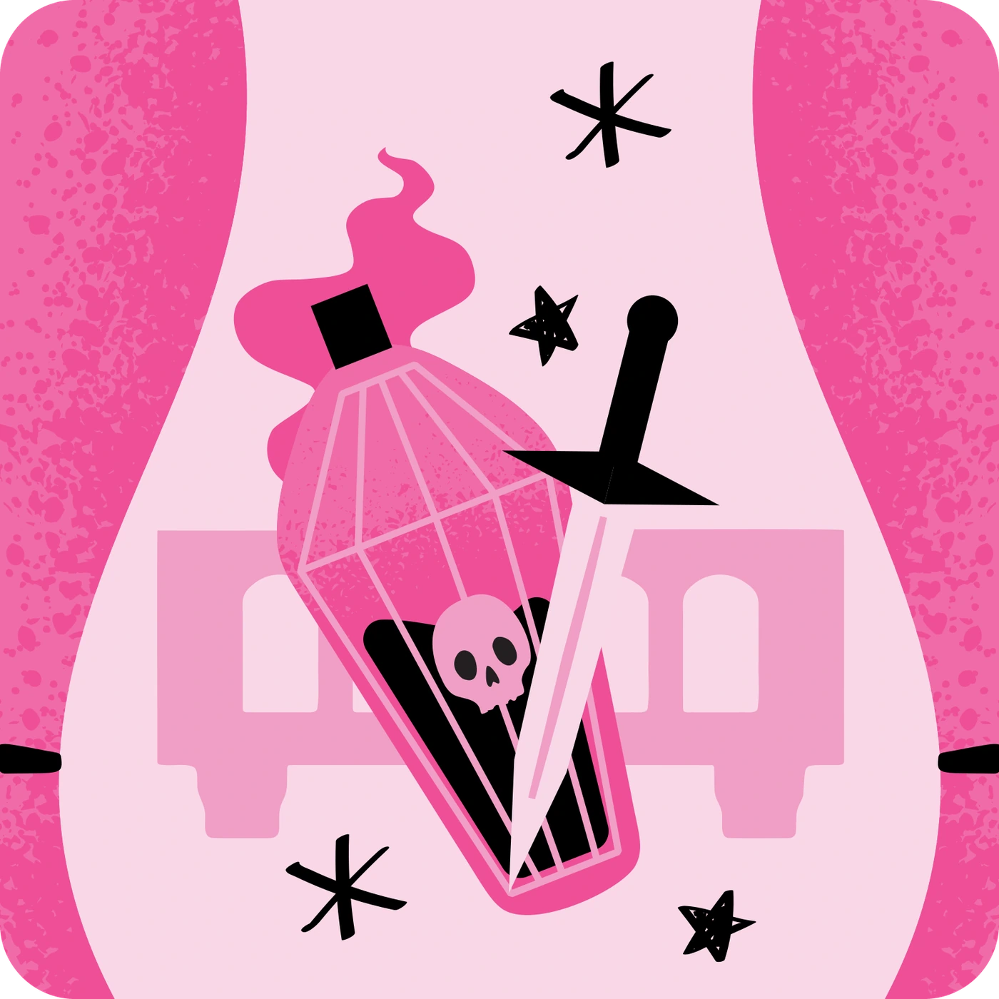
Romeo and Juliet
A vial of poison and a dagger crossed in front of the balcony: symbols of their fatal love.
A sticker series inspired by Shakespeare's tragedies.
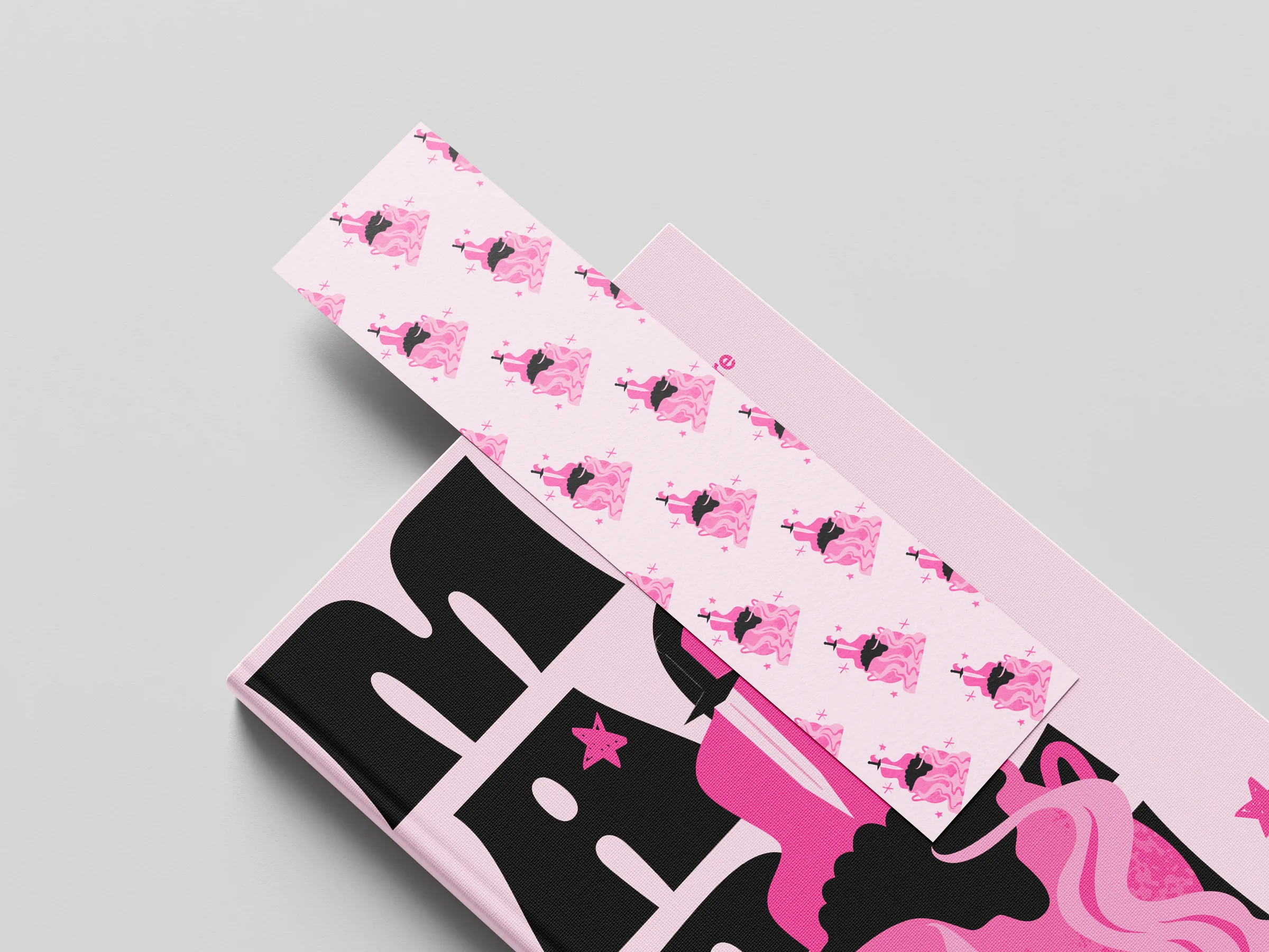
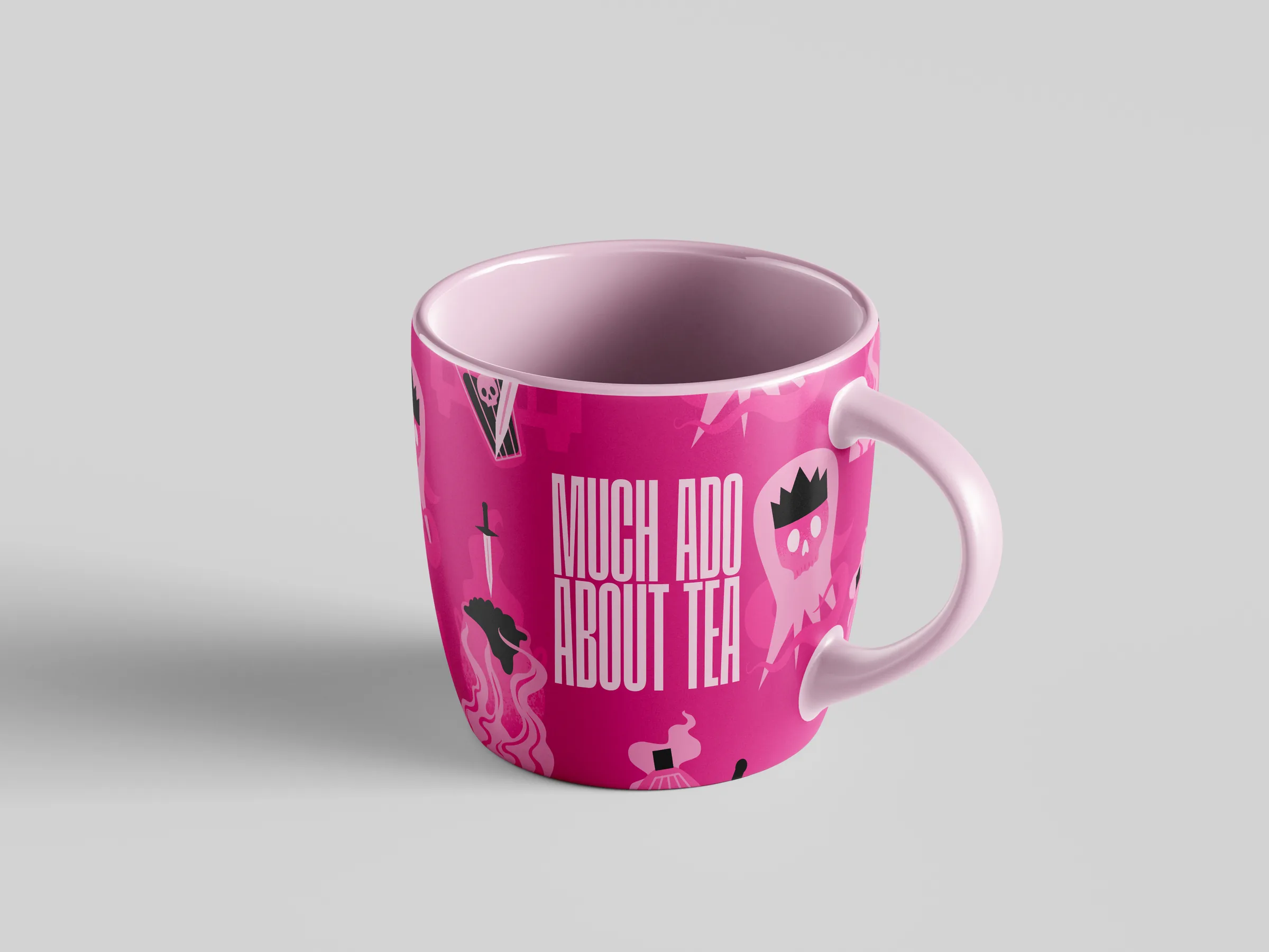
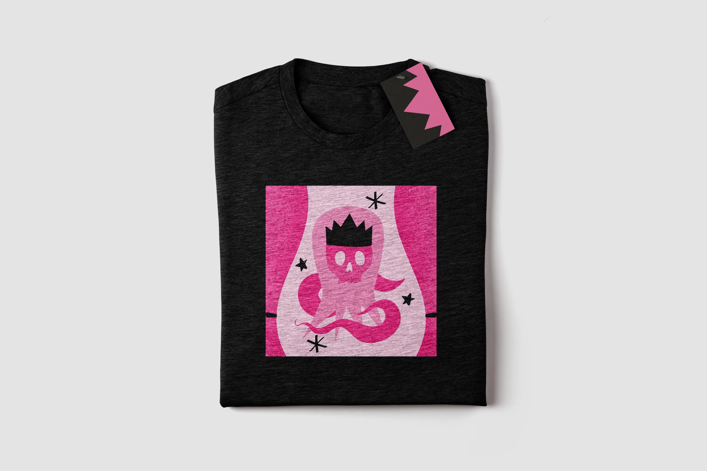
Each tragedy is staged between the same pink theatre curtains, with one symbol at the centre and a scatter of stars around it. A shared frame, palette and texture make the series a reusable visual system: a new play only needs a new symbol.
Off the sheet
The system carried onto a book cover, a bookmark, mugs and a t-shirt.
Duel club
- Context
- Contest, winner
- Year
- 2025
- Services
- Logo design, brand identity
- Software
- Illustrator, Photoshop, After Effects

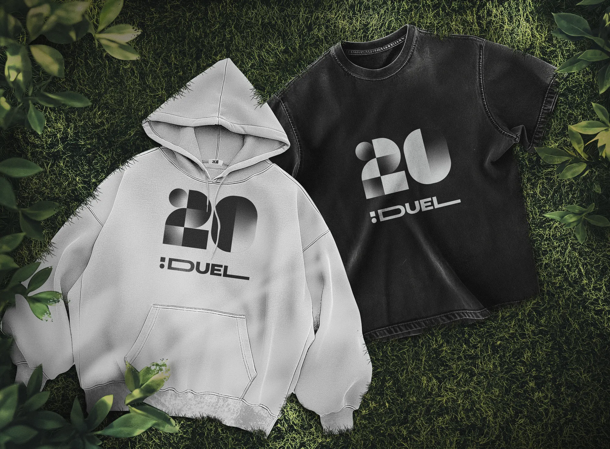
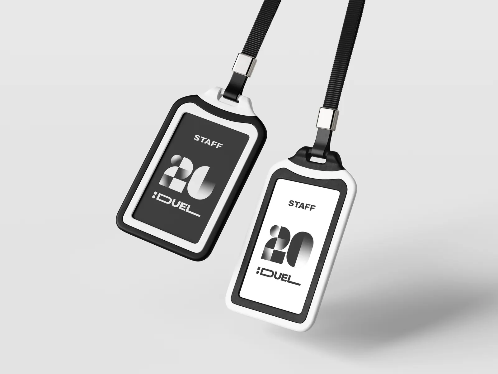
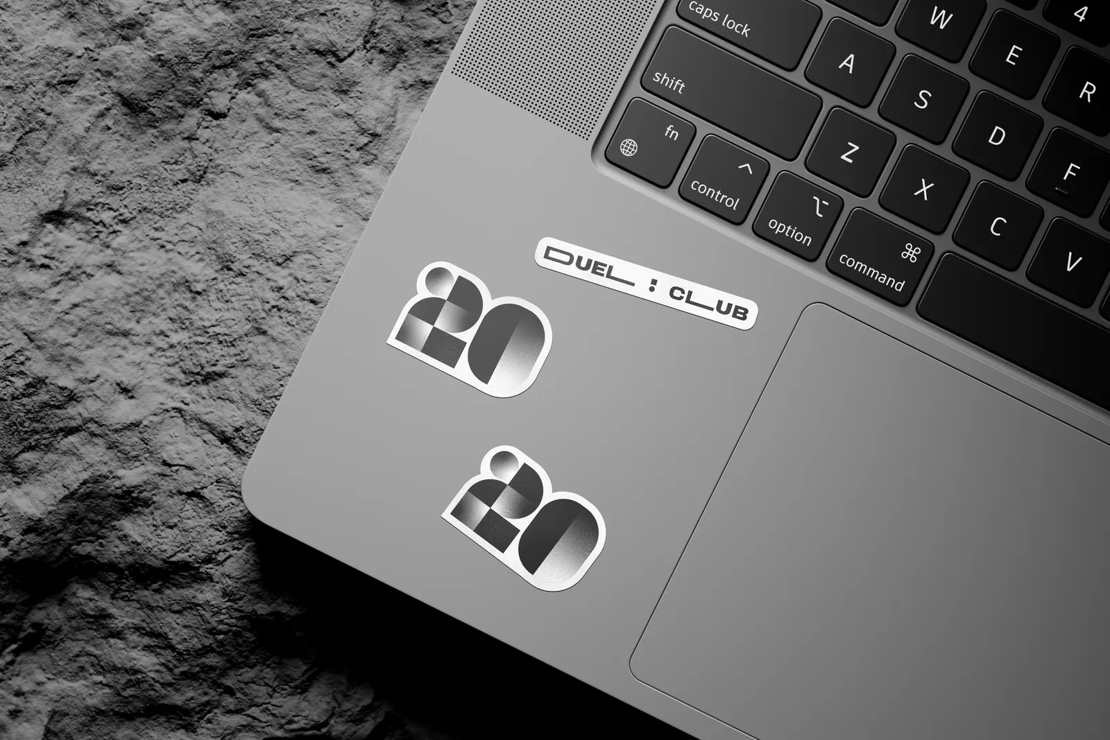
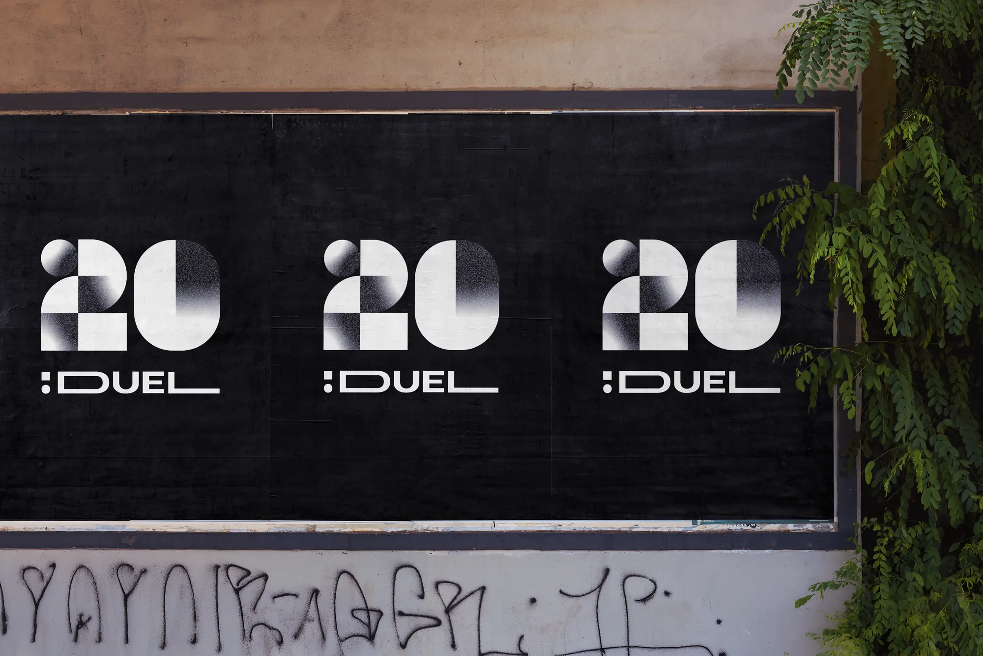
The logo for Duel Club's 20th anniversary, and the contest that won it.
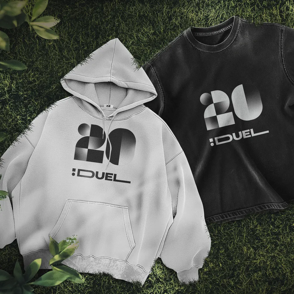
For its twentieth anniversary, Duel Club in Naples needed a new mark, and Ilas ran a contest on the real brief. My proposal won. I designed the 20: a number built from simple geometric pieces, squares, quarter circles and arches, in black, white and a soft silver gradient, made to sit above the club's existing :DUEL wordmark. Alongside the logo I designed the brand variations and applications, and a motion presentation in After Effects. The prize was a place on the Master in Social Media Management at Ilas.
Out in the world
Urban sound
- Context
- Academic project
- Year
- 2025
- Services
- Visual identity, poster design
- Software
- Illustrator, Photoshop


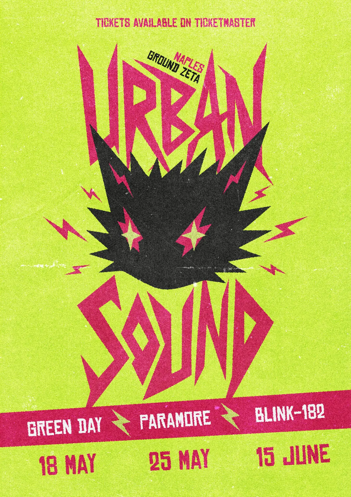
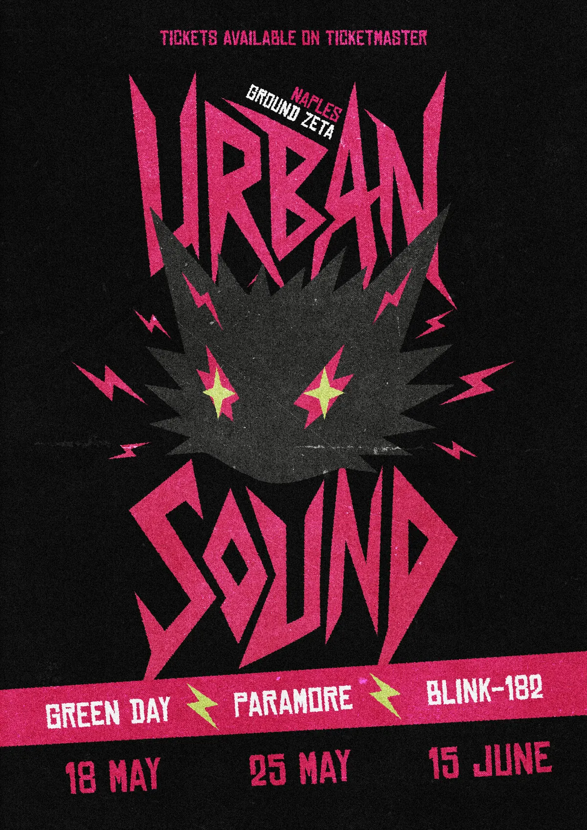
Identity and posters for a punk rock festival, loud on purpose.
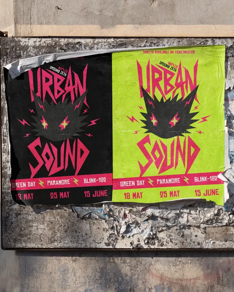
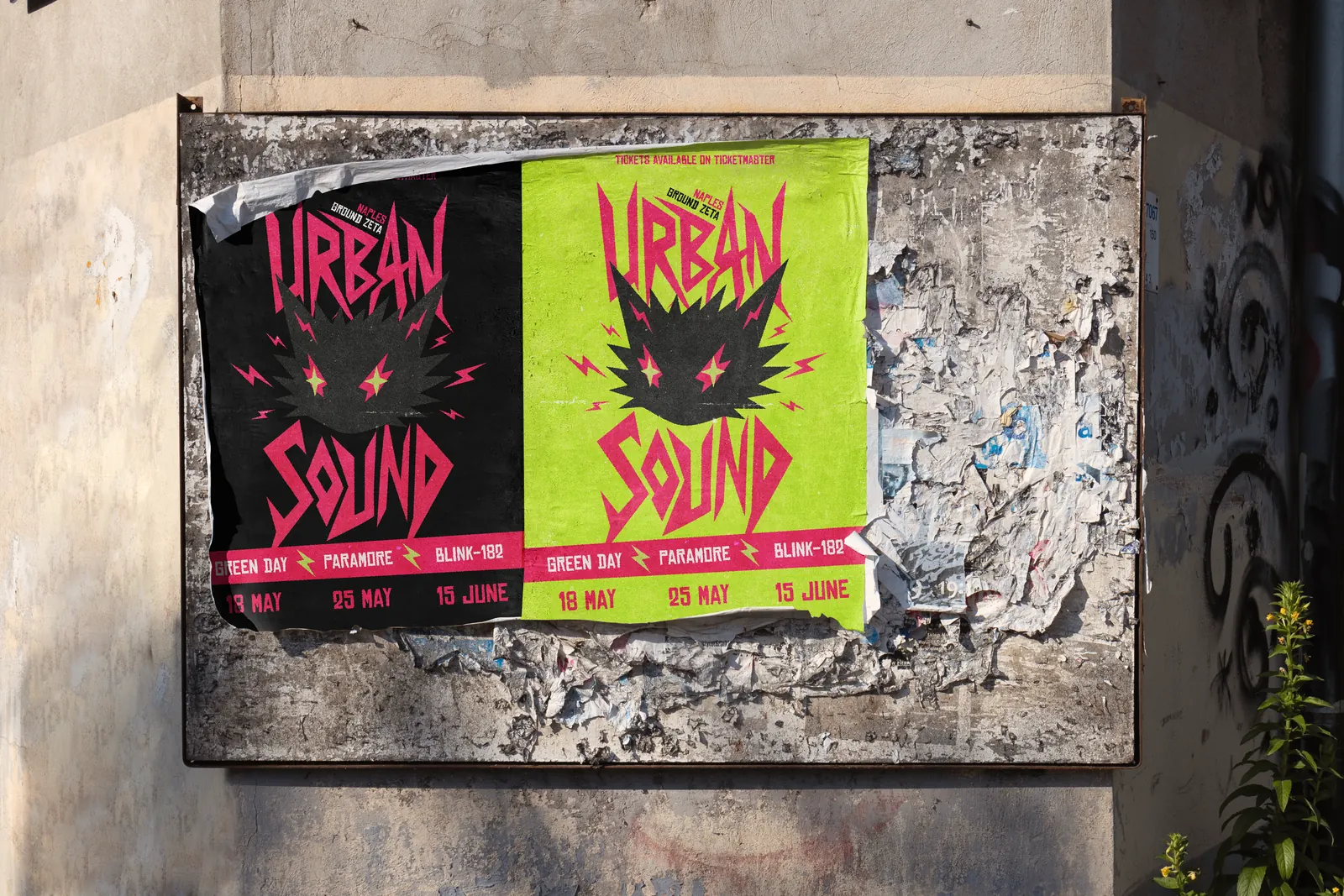
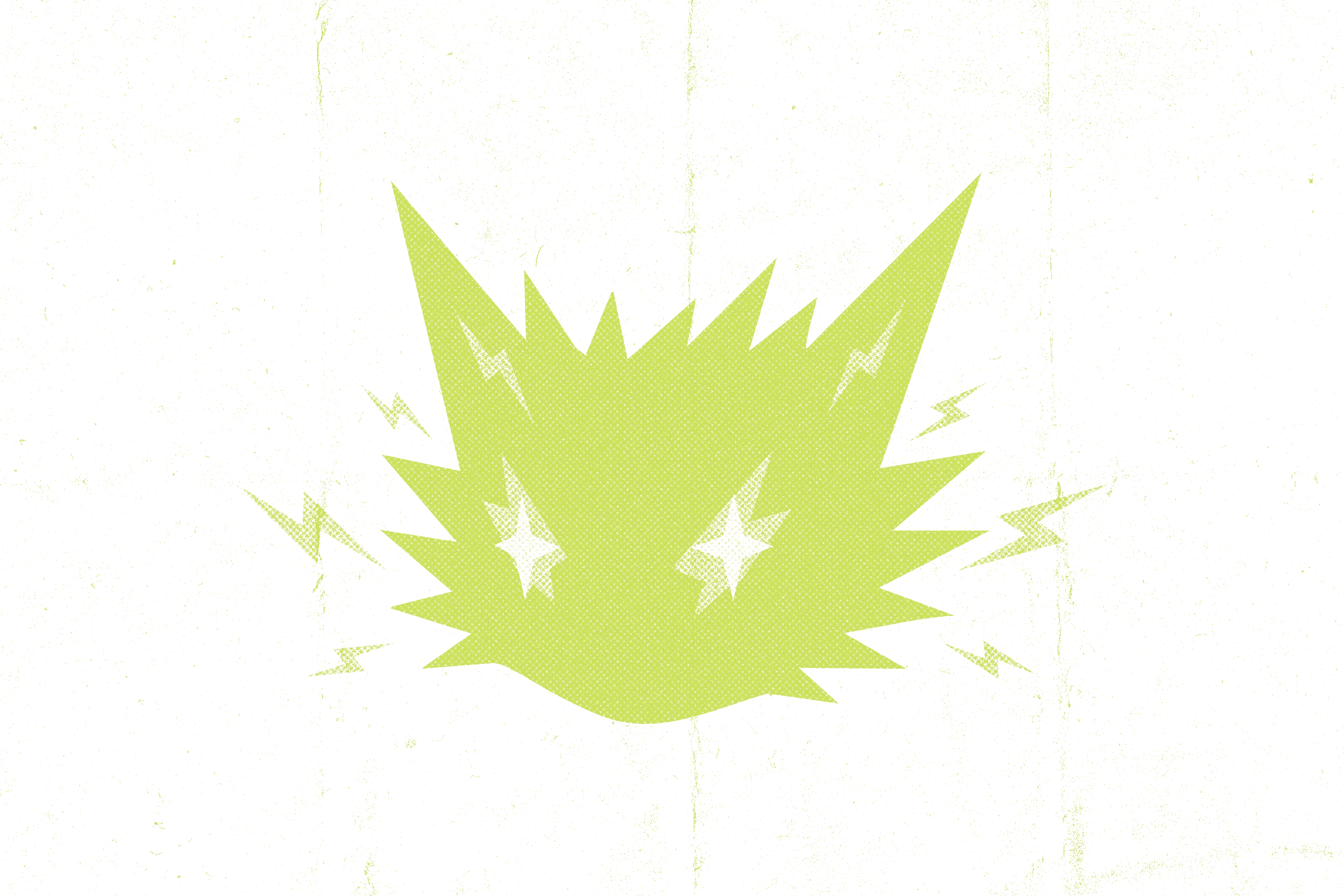
The mascot is a spiky black cat with star-shaped eyes, crackling with lightning bolts. The lettering is hand-cut, tall and jagged, like a gig poster stapled to a wall. Two colours do all the shouting, acid green and hot pink, on black. Bold type and a few strong graphic elements make a system that holds together from the poster down to a wristband.
The posters
Tickets and merch


Helos academy
- Context
- Academic project
- Year
- 2025
- Services
- UI/UX design, web design
- Software
- Figma, Illustrator







Nova museum
- Context
- Academic project
- Year
- 2025
- Services
- UI/UX design, web design
- Software
- Figma


Social media
A look at the feeds I work on at the agency: nine posts per client, carousels and reels side by side.
Thesan
Pilates and Gyrotonic® studio
CarouselReel
Dr. Rosa Bifulco
Nutritionist specialising in fertility
CarouselReel
Studio Busiello
Beauty, skin and body care studio
CarouselReel